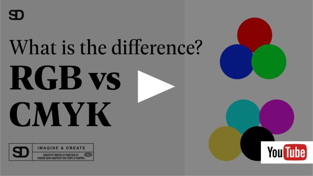
RGB vs CMYK and why color mode matters in design.
You’ve carefully selected your brand colors, designed your logo, and are now ready to introduce your brand to the world, but you likely haven’t considered that in order to keep it consistent, you will need to understand the difference in color mode (RGB vs CMYK), why color mode matters in design, and how it affects the presentation of your brand.
You’ll need to begin by considering the mediums you’ll be using to market your brand and how you’ll keep the integrity of the colors in tact across these varying platforms. Often overlooked in the non-professional design world is the consistency of brand colors and how they are viewed differently in print and digital design.
When you’re having a design created, it’s important to know the difference between RGB and CMYK color beyond just what the letters stand for (red, green, blue and cyan, magenta, yellow, black). Each color mode, or space, plays a different role in ensuring the correct translation of a brand into print, whether that’s digital or physical. Depending on what your expectations are for the final product, one will always be better than the other.
What are color modes?
Color modes (or spaces) are essentially the different ways in which the components of a color combine to produce (or reproduce) an image. They’re like languages which use different approaches to capture color information.
Just like our eyes have a system in the way they capture the light and interpret colors, so do cameras, computers, and print displays. Depending on the final product, the system used to interpret those colors can vary. Color modes will look different to the eye depending on the platform with which they are being viewed – that is why color mode matters in design.
What does this mean in design?
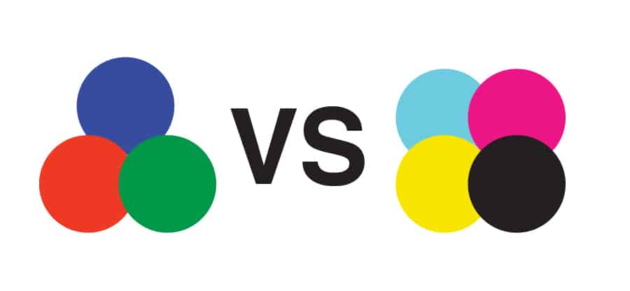
In design, both RGB and CMYK are modes for mixing colors. Simply put, RGB is best for digital work, while CMYK is ideal for printed work.
RGB stands for Red, Green, and Blue, and designers combine those three colors together in varying proportions and intensities to create any color in the visible spectrum. When you combine the three colors in the same amount, you get white.
CMYK stands for Cyan, Magenta, Yellow, and Black. These are the four basic colors used for printing color images. Unlike RGB, CMYK color are “subtractive”, which means the colors get darker as you blend them together.
Not sure how to convert from one mode to the other? Click here!
When to use RGB vs CMYK?
If the final destination of your design project is anything on a digital screen, then RGB color mode is best. This includes web and app design (buttons, graphics, icons), branding (logos and ads online), social media posts and pictures, and any other visual content (videos, etc).
If the final output for your design project is physical printing, then use CMYK color mode for more accurate results. This includes branding (stationary, business cards, signs), advertising (posters, flyers, brochures), or merchandise (t-shirts, pens, mugs, etc).
Working with a designer not only ensures that you are using the correct color modes for the correct branding projects, but they can ensure the right file formats are used with the right modes. There are certain file formats that are better for RGB, and for CMYK. If you’re not sure which is which, you may end up with formats that are not compatible with most software or can be too large to easily be of use.
JPEG, GIF, PSD, PNG, AI, and EPS are all file formats that are necessary to ensure you can create a variety of projects to showcase your brand, and each one requires the right color mode to ensure an accurate reproduction of your brand in the appropriate format.
Don’t let all the hard work you put into designing your brand go to waste by choosing the wrong color mode or file format when sharing your brand. A graphic designer can help ensure that your logo, your color palette, your entire brand identity, are accurately represented no matter how you choose to showcase it. They will make sure your logo colors work in both color modes so you don’t loose the effect of your brand in different mediums.


Read more about what a graphic designer can do for your business here!


