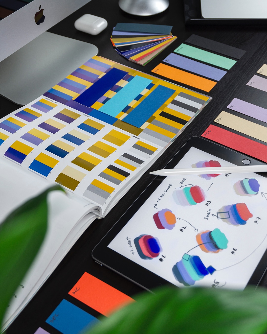
When working with a graphic design firm to create a logo for your brand, your designer should present you with a logo “comp.” In design speak, a comp, short for “comprehensive layout” or just “comprehensive,” is a layout of a proposed design to be reviewed with the client before the design is finalized. At Stellen, we believe that one of the most important considerations when presenting a logo comp is to be sure to include three different layouts of the brand’s logo. We usually present a few different comps, each including the three different layouts, along with multicolor and one color versions for the brand to decide among. Crucially, though, your logo should come as a set. So which layouts should be included? Here’s what we believe to be the three essentials in any logo package:
1. Horizontal Layout
A horizontal layout will usually consist of a logo mark justified left or right and text on the other side on one or two lines. The proportions will be wide and short. This will ensure the logo will not only fit but will also look good and be legible on a website navigation, letterhead, or any other horizontal space.
2. Vertical Layout
These are usually the most “brand-driven” layouts because the mark is dominate and it creates brand recognition. The logo mark will be larger and occupy most of the space. The text or legible portion is usually smaller and often placed underneath the mark. Vertical layouts fit well within a square or circle and are generally better for packaging. Think of the logo on your Starbucks coffee cup vs the logo they use on their awning—what you see on the awning is a great example of a horizontal layout, whereas the coffee cup features a typical vertical layout.
3. Logo Mark
The logo mark is the iconic symbol of your brand. It is usually a drawn shape or illustration of something representing your business. The logo mark should be able to stand alone without the business name, text, or tagline. The most iconic logo mark, in our opinion, is the Nike swoosh. Universally, people recognize the symbol without the word “Nike.”
In addition to these three layouts, a proper comp will also feature your design with options for color as well:
1. Full Color
This one is pretty obvious—a full color logo is simply the logo rendered in color. It may be one color, two colors, multiple colors, or gradient colors, depending on your brand and design preferences. While color is beautiful and striking, it is crucial to make sure your logo is not dependent on the color. That’s why we include the full color logo as secondary to the other layouts: you have to be sure that your logo is powerful in black and white before choosing a color scheme.
2. One Color
We prefer to initially present logos in a one-color format. This ensures that the design is strong without color and will still make sense as a one color version. Logo marks should be simple, and reviewing in a color helps keep the design clean and distinguished.


