Picking a brand color is a little more complex than looking at a rainbow and pointing to the color you like best… Now is green a good brand color??
Believe it or not, there is a science to the way people perceive and respond to different colors and today we want to hone in on green to find out if green is a good brand color for your business.
I was inspired to write this post by two re-brands that switched their colors and added green as a brand color! Was this smart for the long haul? We will have to wait and see… but what let’s take a closer look at green first then I will share those re-brands!
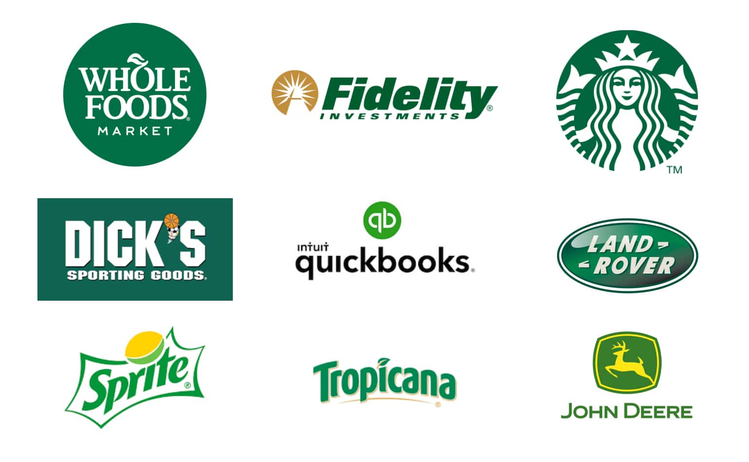
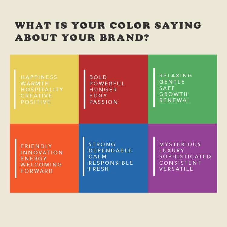
Green is clean, fresh, ambitious, and trustworthy. Green is often the brand color of choice for financial businesses for the obvious reason of our American currency being green and is also used commonly on health foods or green eco friendly products. In Europe pharmacies use green (coming from California a green cross symbolizes Cannabis shops so I was a little confused seeing a green cross as a symbol for pharmacies Europe). Green shows life and adventure, but it also shows jealousy and inexperience.
Fun fact about green:
Did you know prior to the 1960’s most medical scrubs were white? That posed a problem, when blood showed up on the scrubs it was bold and drastic. Often distracting to the eye making it harder for surgeons to focus. The solution: making scrubs the common greenish blue color we see today gave the blood a complementary canvas and it would turn a less distracting brown color when it hit the fabric, making it easier for the surgeons to focus on the task at hand.
Now let’s look at those two re-brands I was talking about then we will weigh in and see if green is a brand color or not?

First up: Providence medical group vs Little Company of Mary Providence
Little Company of Mary is a local hospital that was acquired by Providence medical group and over the years has shifted their branding. The Little Company branding was royal blue and orange, the Providence branding, royal blue and kelly green. Orange and blue are complementary colors, meaning they are on opposite sides of the color wheel and really help each other stand out! Whereas blue and green are right next to each other on the color wheel and don’t accent each other, instead they fight for attention and blend together. So overall with the new colors the logo and signage is less noticeable and doesn’t pop as well as the previous color.
Another major downfall from switching orange to green is how green looks on grey. Let me tell you… it’s not good. One of the local medial buildings is a grey stone building. Now that the logo is blue and green it barely shows up. Before the blue was hard to see but that orange helped…now that it’s blue and green on grey, it’s impeccably hard to see.
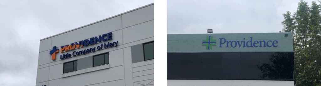
So… if you are thinking of going with a kelly green for your brand logo, I would think twice if street visibility will be a big factor in your branding and marketing. If you have lots of store fronts and signage I would advise of using two complementary colors so you have something that will really pop and stand out on the side of a building.
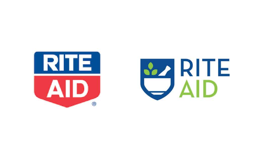
Next up: Rite Aid
Yes if you haven’t noticed Rite Aid did a whole re-brand… they went from a red and blue bold shield logo to a mortar and pestle that is blue and spring green. I get it, they were trying to have a more hip healthy vibe and less old school medical vibe… but where this re-brand went wrong was once again not addressing the primary use of the logo. Rite Aid does most of its business in the physical stores. If you are driving down the road and see a Rite Aid sign you might be reminded of something you needed, pull in and of course buy what you needed and more. If you are on a vacation and realize you forgot toothpaste, you will be keeping your eyes peeled for the closest drug store. Visibility is key in both of these scenarios. In California we have a lot of CVS and Walgreens drug stores which are both red… you will be looking for red, not blue and light green as you drive.

Rite Aid’s old colors red and blue were complementary colors…now with the blue and green they are not. Their shade of green is lighter than the one used in Providence’s example but the fault in their green is how it works on white! The background color on all of the Rite Aid signs is white, the same goes for their semi trucks, shopping bags, and house branded packaging. Bright, light green is very hard to see on a white background. I have great eyes and it’s hard for me to see… I can only imagine how it is for someone with not such great eyesight.
To re-cap green as a brand color…
Before you choose green as your brand color, think of your primary use and then decide. Green is the brand color for Fidelity Investments. It works great for them since they use their logo mostly in digital forms or printed materials with a bright green logo on a white background. While they have brick and mortar branches they don’t acquire the bulk of new customers through those branches. If you are looking for Fidelity Investments you will find them, but it’s unlikely you will be driving down the road, see a Fidelity branch and be reminded you have to go there. They don’t need to rely on quick visibility like Rite Aid does.
Thinking of the primary use for your logo is crucial in brand development and re branding.
If you are a digital business, go green all you want! If you are looking to become the next Target… I would rethink that green! Reach out if you have questions about choosing the right brand color for your business!
Want to know what the “hungry” colors are?


