I talk about brand consistency on the blog a lot because I firmly believe that consistent brand imaging is so important, and yet so often overlooked!
Any time I see an example of a company with conflicting or inconsistent design choices, it just reaffirms to me how important branding can be for a company’s image in the eyes of consumers–even consumers who aren’t always thinking about design like I am!
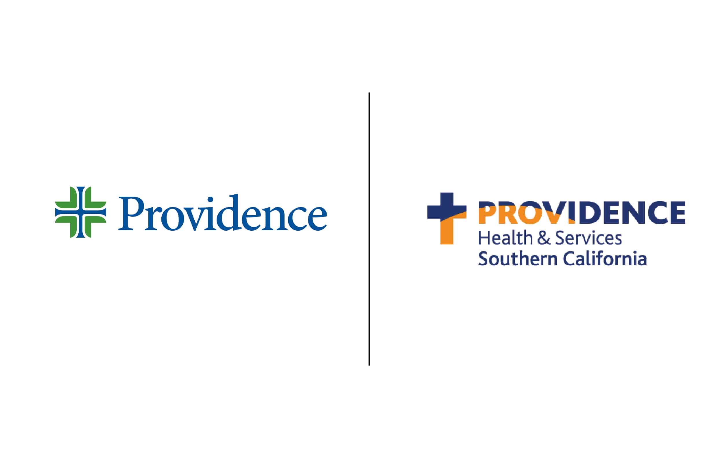
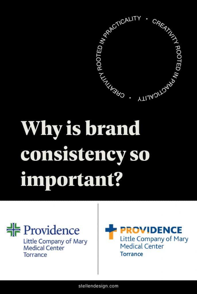
Recently found an example of lack of brand consistency that affected me personally so I wanted to share. It is a great example of what happens when your branding isn’t consistent. South Bay locals will know that Little Company of Mary Hospitals, the main being in Torrance CA, which was bought by Providence some years ago, had a logo of a cross and a rising sun, and their colors were blue and orange. After the acquisition, they changed their name to “Providence Little Company of Mary”, but fought to keep their logo and colors, and now there’s a total disconnect! Providence has a blue and green logo, which is totally different than Little Company of Mary’s.

The Problem…
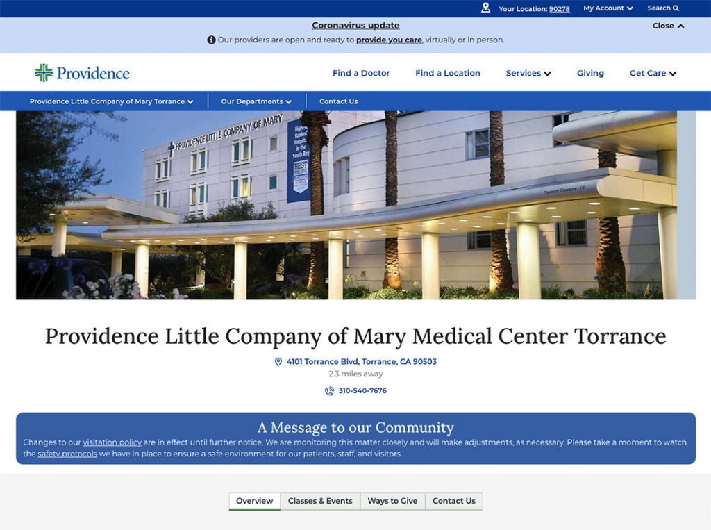
When I was pregnant, I was looking for the hospitals website to register and it was a very confusing experience. I google searched and my first thought when I found the was this is the wrong site–maybe I had stumbled onto a hospital in Providence, Rhode Island or something! This is not my hospital, my hospital has the orange and blue cross logo…The mismatch between the name and the logo really threw me off, since I was accustomed to Providence’s branding looking one way and now it looked totally different, not at all like the Providence I knew here in the South Bay. I checked my google search a few times and it wasn’t until I read the copy and say “Torrance” and “Little Company of Mary” written in the website copy that I felt confident I was on the right website.
Here is a link to Providence website I am referencing incase you want to have a look.
First and foremost, brand consistency helps your customers gain trust in your brand. When something is familiar, there’s an underlying sense that it is trustworthy–people feel good with what they know! On the other hand, mismatched branding can be confusing and off-putting to consumers; they feel like they don’t know what to expect anymore, and the comfort and familiarity they used to have is gone. I felt totally lost and confused when I was on the new Providence website, because that sense of familiarity was missing. It’s like those weird dreams where you are at your mom’s house, but it looks totally different and it’s not your mom’s house.
The Solution
Merging two different brands can be difficult from a design perspective, that’s for sure, but I think that there are a few ways in which Little Company of Mary and Providence could have done a better job at maintaining some sense of brand consistency. Though the combination of orange and blue is an eye-catching choice (since the colors are complementary) and the old Little Company of Mary logo is bolder (in my opinion, better) than the centered cross in the Providence logo, the brand should have just bitten the bullet and changed their whole design system when they became part of Providence. A brand’s name and design are linked in the minds of consumers, and apart from the old name, the old colors and logo feel out of place.
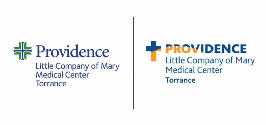
Alternately, if they really wanted to hold on to their original logo and colors, another approach would have been to create their own website and digital assets. This way, everything under the Providence Little Company of Mary umbrella would look the same, which would allow for both parts of the brand to retain some level of consistency. Instead they have all printed materials and building signage with the orange and blue old look and digital assets like websites and web ad’s with the new Providence logo creating a disconnect.
Brand builds trust. It’s that simple. Showing brand consistency makes your customer feel safe, secure, and understand. Mix matched branding has the opposite effect. When is comes to a hospital and or any medical professional for that matter, trust is crucial.
I hope this example was helpful in illustrating why branding is so powerful! Sometimes the little things really do make a big difference.
Looking for some brand consulting help! Let’s chat!


