
What makes a good logo?
Have you ever wondered if your logo was good or not? Did you have it done 10 years ago and are you wondering if it’s still working for you? In my years as a brand designer I have had to coach countless clients on what makes a good logo. I’ve had to teach them not to focus on what they like or what they want… as hard as it is to hear that sometimes! The truth is, a good logo must be 3 things… visible, memorable, and relatable. If your logo doesn’t check all 3 boxes, it is not a GOOD logo.
If you want to audit your own logo we have a quick quiz for you to do so! This guide will help you decide if your logo is helping or hindering your sales and give you actionable solutions for improvement!
Let’s talk visibility.
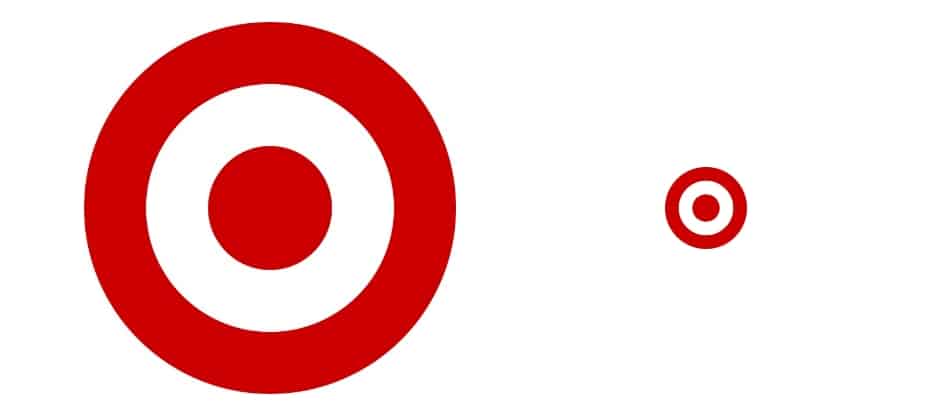
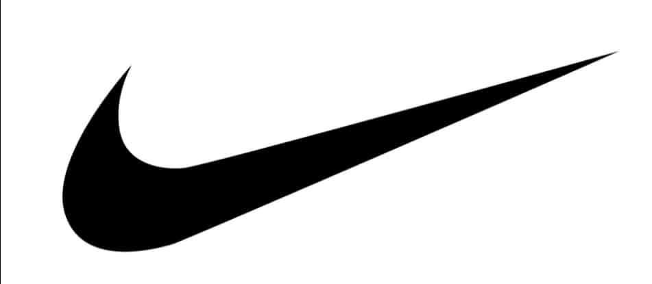
This is crucial for a logo. If your logo is not visible, it can’t do its job. Your logo’s job is identification, not communication… and in order for something to work as identification, it has to be seen! Think of how you can spot the Target logo quickly and easily from the highway, their logo is very visible! Or Nike’s logo on a shoe.
The best test for visibility is checking the scale of your logo. A logo that can scale looks great when it’s very big (on the side of a building big) and great when it’s teeny tiny (app icon tiny)… Logos with thin lines and too much detail can be problematic.
If you were trying to convey too much in your logo when having it designed it’s time to rethink and simplify. Your logo should not be communicating to your audience, that is your brand’s job. The logo needs to work as identification.
What makes a logo memorable?
Simple = Memorable. Our brains can only retain so much in a short amount of time. If someone sees your logo for a few seconds, will they be able to remember it? The simpler the better when it comes to being memorable! If your logo is on the simple side, you are in good shape! Yes, you want to be unique to also be memorable… but if your logo is too complex your audience will not be able to remember it.
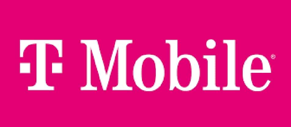
Another factor for memorability is color. Selecting a bold and suitable color that aligns with your industry will be helpful in making your logo memorable. Think of T-Mobile… their logo is just a T, but you remember the pink color! When all other phone carriers went with primary colors, T-Moblie went out of the box with pink. It’s memorable. Simple logo… bold color… memorable logo.
Your logo should be a design, not art. Logos with too many colors start to look like works of art instead of logos. If your logo is straddling the line between an illustration and a logo… chances are there’s room for improvement.
What is relatability?
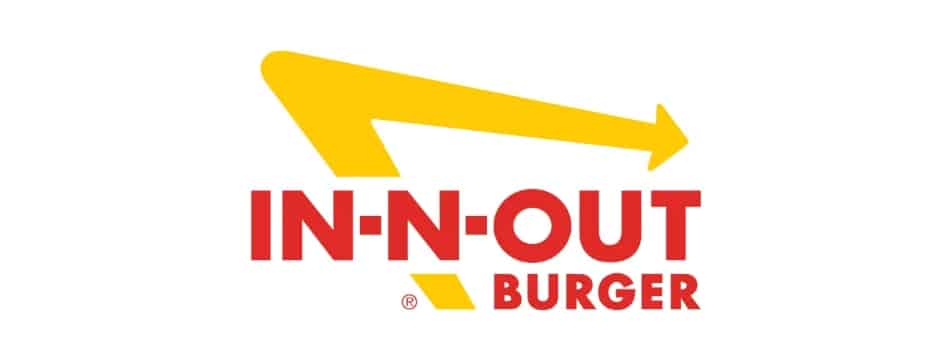
When it comes to a good logo, your logo must relate to your industry or business. Now, don’t take this too literal… I don’t mean if you are a hamburger stand your logo needs to be a hamburger. But it does need to relate to your business somehow. Look at In N’ Out… they are a west coast hamburger chain and their logo is an arrow. They are showing speed and movement with their logo. The chain is known for getting guests in and out with tasty burgers. The arrow is very relatable to their business.
Your logo needs to feel like your business in order for it to be relatable. If you are a high end real estate firm, your logo should look very high end for it to be relatable.
Step back and see if your logos makes sense for your business. Is it an accurate depiction of your business and is it in alignment with your goals for your business?
Questioning if your logo is good or not?
I know, you might LOVE your logo and want to go against the grain, but trust me, letting go of something you love because you found out it’s not good for you, is a good thing! If you are trying to lose weight, we all know to put down the chocolate cake and try an apple instead… if you are trying to grow your business, getting rid of the old logo that is not helping you is a good thing!


