Logo designs that scale are invaluable to a company.
When it comes to logo design, scale is one of, if not the most important thing. I have touched base on scale in articles before but I think it’s worth taking a deep dive into the world of logo design that scales!
What is “scale”?
Scale refers to the ability to scale up or down in size. Think of something really big like a wrap on the side of the building, now think of something very small, like the app icon on your phone, or even smaller like the favicon in the left-hand corner of your browsers search bar. Scale is the ability to adapt to those different sizes.
Logo designs that scale well can be used in any application and will still look great and be easily recognized. Worried your logo design doesn’t scale?? Don’t worry, there is always a workaround and we will touch base on that later on.
Logo Design that scales
Here are a few of my favorite logo designs that have scalability built into them:
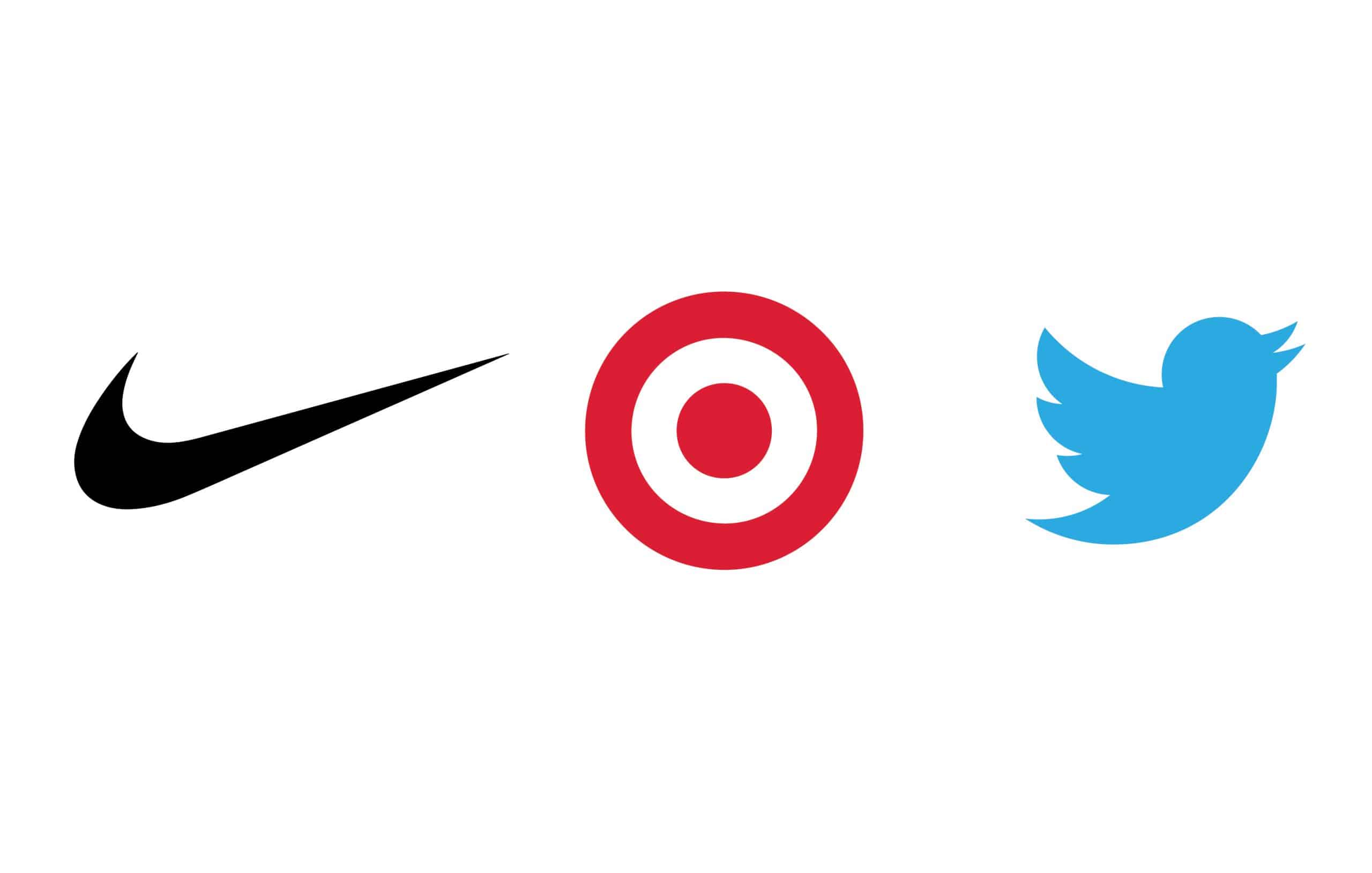
Twitter: Since Twitter was built on a small scale. Meaning the designers knew from the get-go it was going to be an app icon. They designed it small, ensuring it would read on a phone screen. If something works on a small scale it will work at any scale.
Nike: Much like Twitter, Nike knew from the beginning their logo needed to scale. It would have to be recognizable on the side of a shoe. Now the Nike swoosh is one of the world’s most recognizable logo designs. The simplicity of the shape has served them well on shoes as well as billboards.
Target: While Target was not necessarily designed on a small scale, their logo design defiantly looks great both small and large. They designed the target bulls eye mark with their primary use being on the side of the buildings. But, by paying attention to scale they created something that is simplistic and recognizable as you drive past a Target store at 40 mph. You can see the target symbol out the side of your eye and instantly know what it is.
Logo Design that does not scale
Starbucks: I give props to all the designers at Starbucks. Their badge style mermaid logo mark is not the most versatile or easy to work with. Yet they always adapt and make the most of it. It is obvious when they first designed the twin-tailed mermaid they were thinking they were starting a small Seattle-based coffee company, not the worlds most famous coffee shop.
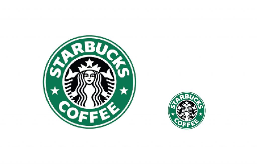
From the original logo back in 1971 to the present day their logo works best on the side of a coffee cup. While they have adapted as best they can they are lucky to have brand recognition on their side. I have the Starbucks Rewards app on my phone and I know instantly what it is because Starbucks is ingrained in my brain, but if it was a new company I couldn’t close my eyes and picture their logo, it would be confusing.
Here is a great read on the evolution of the Starbucks logo!
Coca cola: Much like Starbucks, the founders of Coca Cola back in 1887 were only considered with how their logo would look on the side of a bottle. The founders were not thinking small scale at all because, let’s face it, how small would you need a logo back in 1887? The internet and mobile apps were not even in their wildest dreams.
Coca Cola also get by with solid brand recognition. They have created an iconic brand and an iconic color combination of red and white. If you were starting a beverage company today you would probably stay clear of a hard to read script word-mark unless you wanted to go for a nostalgic vibe.
Want to know how strong coca cola’s red and white roots go? They pretty much created the Santa in the red and white suit! Give this a read to find out more.
Harley Davidson: If you haven’t noticed the common theme here… older businesses are more likely to have non-scaling logos but they have solid brand recognition.
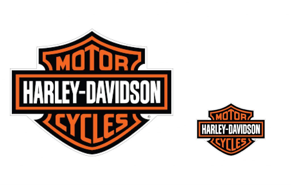
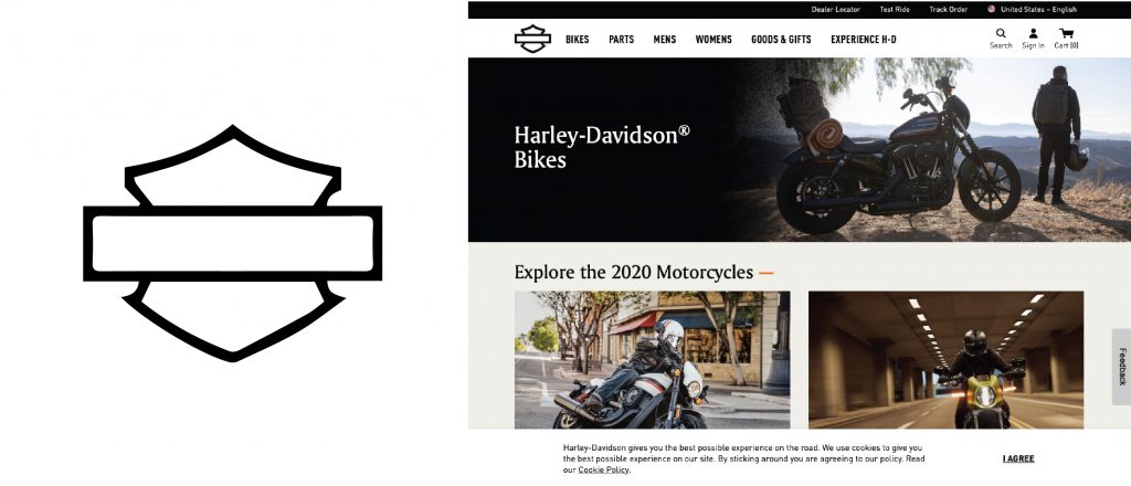
I wanted to share Harley Davidson because its logo is complex and has a lot of parts. The shield shape, the banner shape, plus the words “Harley-Davidson Motor Cycles”… that is a lot to fit in one logo. But they have been able to adapt it brilliantly. They have been able to successfully drop the words in the logo and rely solely on the shield and banner shape. They have reverse-engineered their logo to create a scaling logo system!
Much like we did for Harter Construction.
What to do if your logo doesn’t scale:
Leading off Harley Davidson, I wanted to talk about what you can do if your logo was not designed to scale. Or if you have your heart set on something more complex for a logo. If you have a logo already in use and don’t want to redesign it to scale, hire a designer to do what Harley Davidson did. Work backward to simplify and give you a logo system that will scale. Meaning you have your primary logo, but you also have a simplified version to use in small spaces like an app icon.
If you have your heart set on a complex logo design, that is okay! You can still build a successful brand with a complex logo. Go into the process with an open mind. Look for assets that can be used as part of your logo system. A good example of this would be the logo we did for “The Sunshine Store”, it’s a 5 color logo with typography. But we made sure to do a one-color version and create a rainbow mark they could use on a small scale. It still fits with the brand but is more scaleable.
If you are questioning your logo and if it scales or not… shrink it down to a half-inch square and ask a few people what it looks like to them. If you need help creating a logo design that scales, let’s talk!
Want to know more about logo design? Give this one a read!
