The crew here at Stellen always likes to follow up. So when we put up that neat graphic about how the color spectrum can influence customers we figured we should put up some evidence with it. You know, just in case you didn’t believe us.
While there are always trends with colors across various industries, there is one that is perhaps the most blatant, the fast food industry. Lets face it; fast food companies are maybe some of the most brilliant marketers out there. Everyone knows their product is bad for us, and its quality is designed to be mediocre, and yet certain fast food restaurants are now some of the biggest corporations in the world, not just our country.
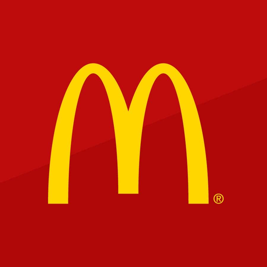
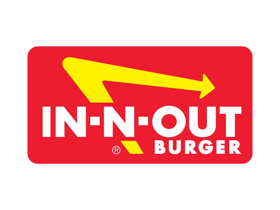
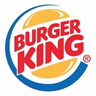
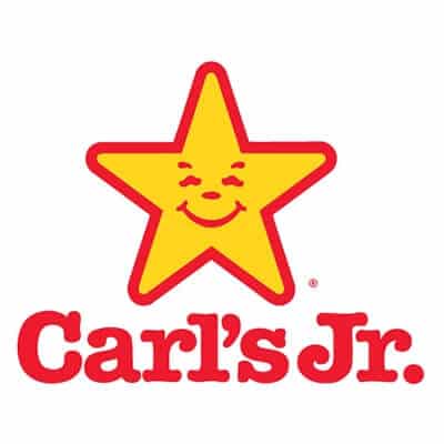
Look across the industry and you’ll notice two very common colors, red and yellow. One, if not both, are almost always incorporated into the logos of fast food chains. McDonald’s, Burger King, KFC, In n Out, Wendy’s, Carl’s Jr., and the list goes on and on from there. So why red and yellow? As you may remember from our chart, red often conjures up feelings of stimulation, hunger, and attracts attention, whereas yellow is often associated with happiness, optimism, and friendliness. Combine the two and you have a recipe perfect for these places. The red and yellow duo invite you in, get you hungry, and then encourage you to get out the door quickly. Yellow is also the easiest color to see in the daytime, so if you have ever wondered why you always seem to pick out the golden arches from the highway first, that’s why.
There may be some detail oriented folk out there that have noticed changing trends away from this color scheme, or at least adaptations to it. The most noticeable of these alterations are with McDonald’s. Many Mickey D’s are getting full makeovers, the insides appear more like a lounge and their signs still have the classic yellow writing but are put against dark, earthy green backgrounds. If anyone has been abroad to Europe, this is how most McDonald’s have looked, over there, for a while. So why venture away from the perfect color scheme? Well when you think about public perception the answer could be obvious. For a company that often gets a bad reputation for having a high impact upon the environment and even its customers by using unnatural ingredients, wouldn’t it be smart to blend your business’s identity with a color that evokes images of being natural, eco-friendliness, and relaxation.
Again, these companies are some of the best when it comes to intelligent branding.


