If you’re Googling “best logos for restaurants” you’re probably not just looking for inspiration to pin on a mood board. You’re likely opening a new concept, refreshing an aging brand, or scaling from one location to five and realizing your current logo can’t keep up. That’s a branding problem, not a design problem — and the two get solved very differently.
At Stellen Design, we build brand identities for restaurant and hospitality groups who are expanding, not just decorating. So before we talk about what makes a great restaurant logo, let’s be clear about what a logo actually has to do for a growing concept.
What a Restaurant Logo Actually Needs to Do
A logo isn’t the brand. It’s the signature at the bottom of it. But it’s also the single most-reproduced asset your restaurant owns — on your storefront, your menus, your delivery bags, your merch, your Instagram grid, your build-out permits. If it can’t hold up across all of that, everything downstream gets harder.
The best restaurant logos share a few non-negotiable traits:
-
They work in one color. If your logo only looks good in full color on a white background, it will fail on a black to-go bag, an embossed napkin, or a laser-cut sign. Test it in black and white before you fall in love with it.
-
They’re legible at 20 feet and at 20 pixels. A logo that reads beautifully on a storefront sign but turns to mush as a favicon or app icon isn’t finished — it’s half-designed.

-
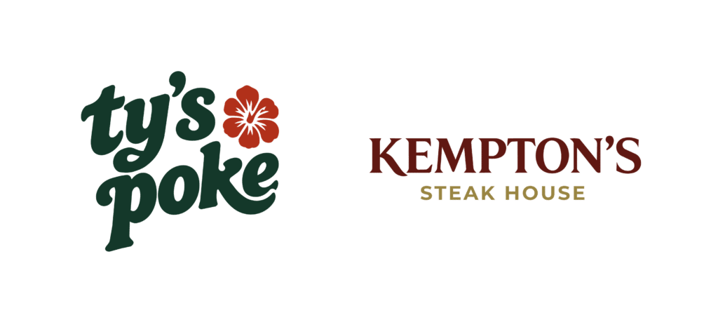
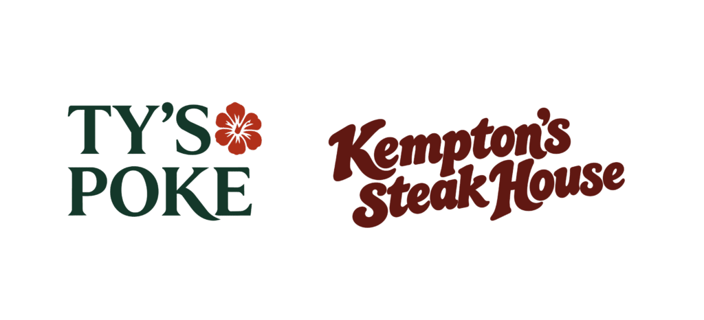
They say something true about the concept. Great restaurant logos aren’t just “food but make it fancy.” A steakhouse logo and a fast-casual poke concept should never be interchangeable, even with the fonts swapped.
-
They’re built to scale. If you’re opening one restaurant, your logo needs to work for that one space. If you’re building a franchise in multiple cities — your logo needs to work as part of a system, not a one-off. Look at McDonald’s: Burgers, Fries & More. Quality Ingredients. as an example of taking that into account.
The Restaurant Logo Styles That Are Actually Working Right Now
Trends move fast in hospitality branding, but a few directions have real staying power because they’re rooted in strategy, not just aesthetics:
-
Wordmark-first identities. Many of the most recognizable restaurant brands today lean on a strong, custom-lettered wordmark rather than a separate icon. It’s flexible, it’s confident, and it photographs well on everything from awnings to Instagram Stories.
-
Emblem and crest-style marks. These work especially well for concepts leaning into heritage, craft, or a specific regional identity — a neighborhood Italian spot, a whiskey-forward steakhouse, a coastal seafood concept. Done well, an emblem feels earned rather than decorative.
-
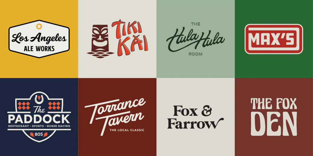
Simplified, icon-driven marks. For fast-casual and quick-service concepts especially, a single strong icon that works as a standalone app icon or delivery-app thumbnail is doing real commercial work — not just branding work. Our work for Tiki Kai is a good example of how a distinctive icon can become a flexible part of a larger restaurant brand identity.

-
Warm, human typography. A lot of the strongest current restaurant identities are moving away from cold, overly corporate type toward lettering that feels handmade or personal — because guests are choosing restaurants that feel like someone made them, not a franchise machine.
Notice what’s missing from that list: gimmicks. The best restaurant logos right now aren’t chasing a trend — they’re making a clear, disciplined choice and committing to it everywhere.
Why “Good Design” Isn’t the Same as “Good Branding”
This is the part most restaurant groups get burned on. A designer can hand you a logo that looks great in a presentation deck and still fail your business, because a logo built without strategy underneath it can’t answer basic operational questions:
-
Does this work across three different concepts under one restaurant group, or does it only make sense in isolation?
-
Will this still feel right in year three, when you’re opening location number four?
-
Does this logo reflect what actually makes your food and your hospitality distinct — or does it just look like “restaurant logo, generic, tasteful”?
This is the difference between aesthetics and aesthetics with soul. A logo with soul is disciplined and distinct — it’s built on a real point of view about who you are and who you’re feeding, not just a font pairing that tested well.
A Quick Gut-Check for Your Current Logo
Before you brief a designer — internal or agency — sit with these questions:
-
Could a guest pick your logo out of a lineup of five competitors, with the name covered?
-
Does it still make sense if you open a second, different concept next year?
-
Does it work in black and white, at business-card size, and blown up on a building?
-
Does it feel like you — the actual food, room, and hospitality experience — or could it belong to almost any restaurant in your category?
If you hesitated on more than one of those, your logo isn’t a design problem you can Canva your way out of. It’s a strategy gap.
The Real Takeaway
The best restaurant logos aren’t the flashiest ones — they’re the ones built with enough discipline to survive contact with the real world: grease-stained menus, sun-faded signage, a fifth location you hadn’t planned for two years ago. Restaurant branding that lasts is built at the intersection of strategy and craft, not chosen off a mood board.
If you’re heading into a pre-opening build-out or planning your next concept launch and want a brand identity built to scale with you — not just look good on day one — that’s exactly the work we do at Stellen Design. We’d love to talk about what’s next for your concept. (link here Los Angeles – Contact Us – Stellen Design )