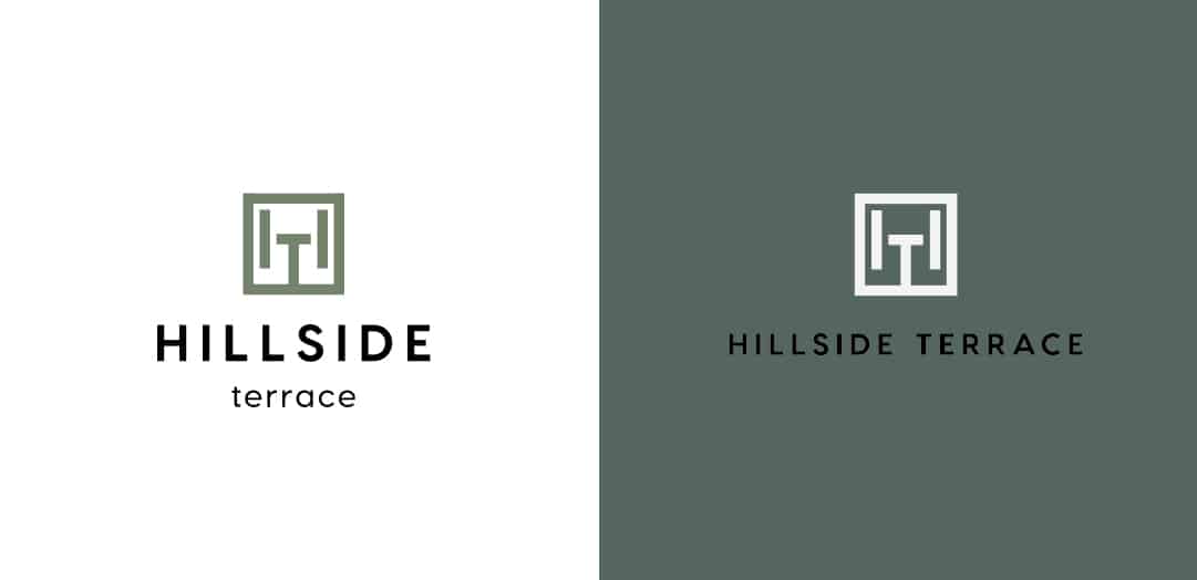
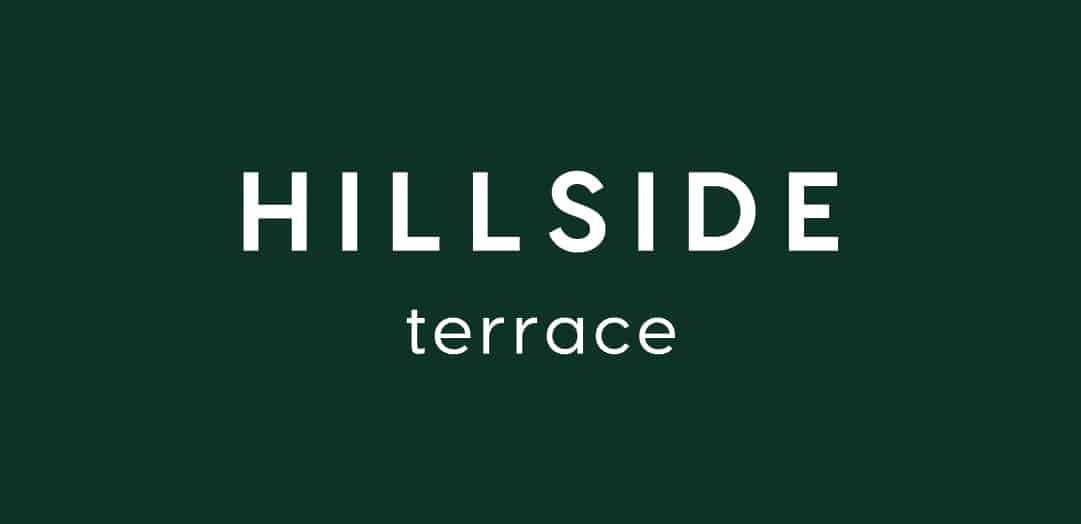
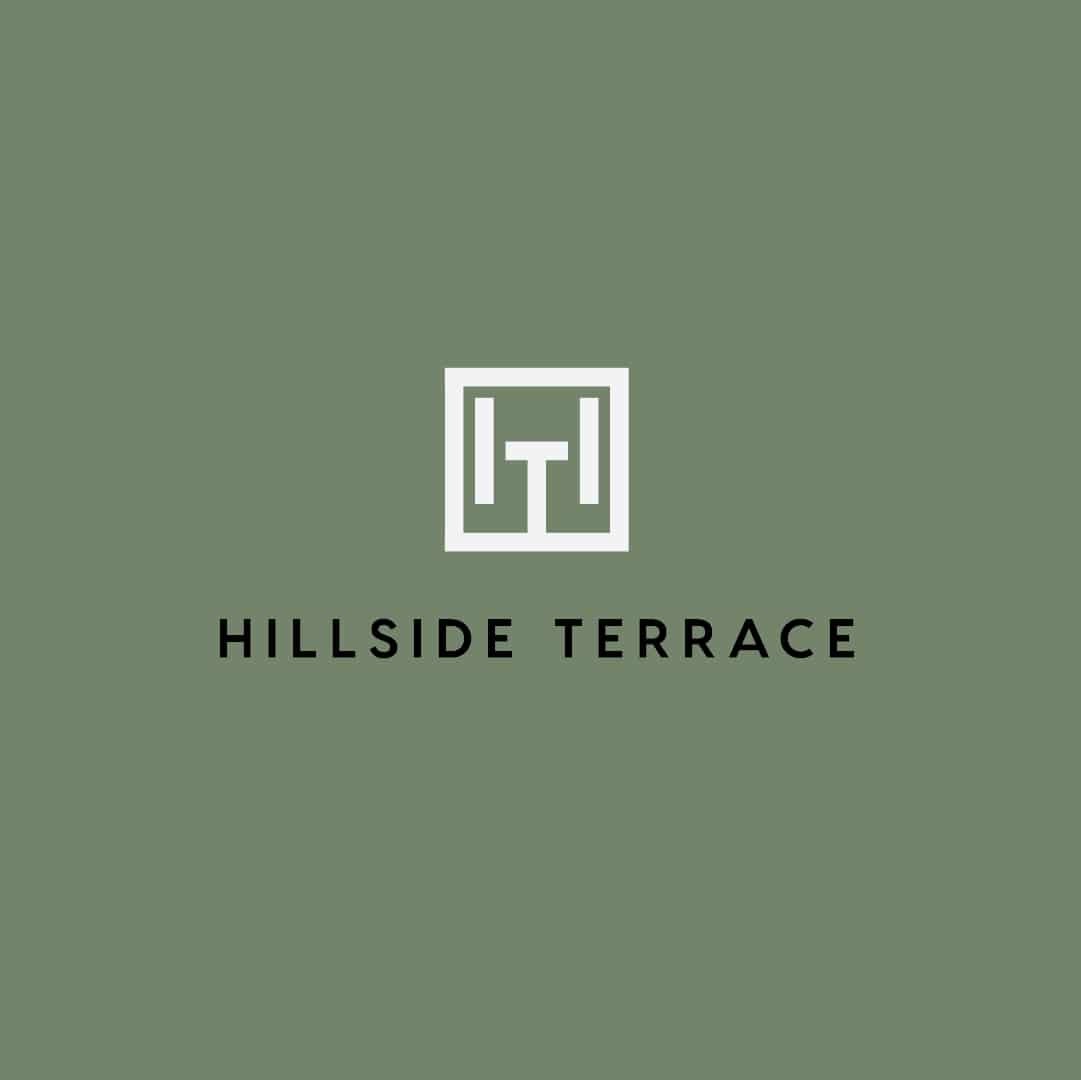
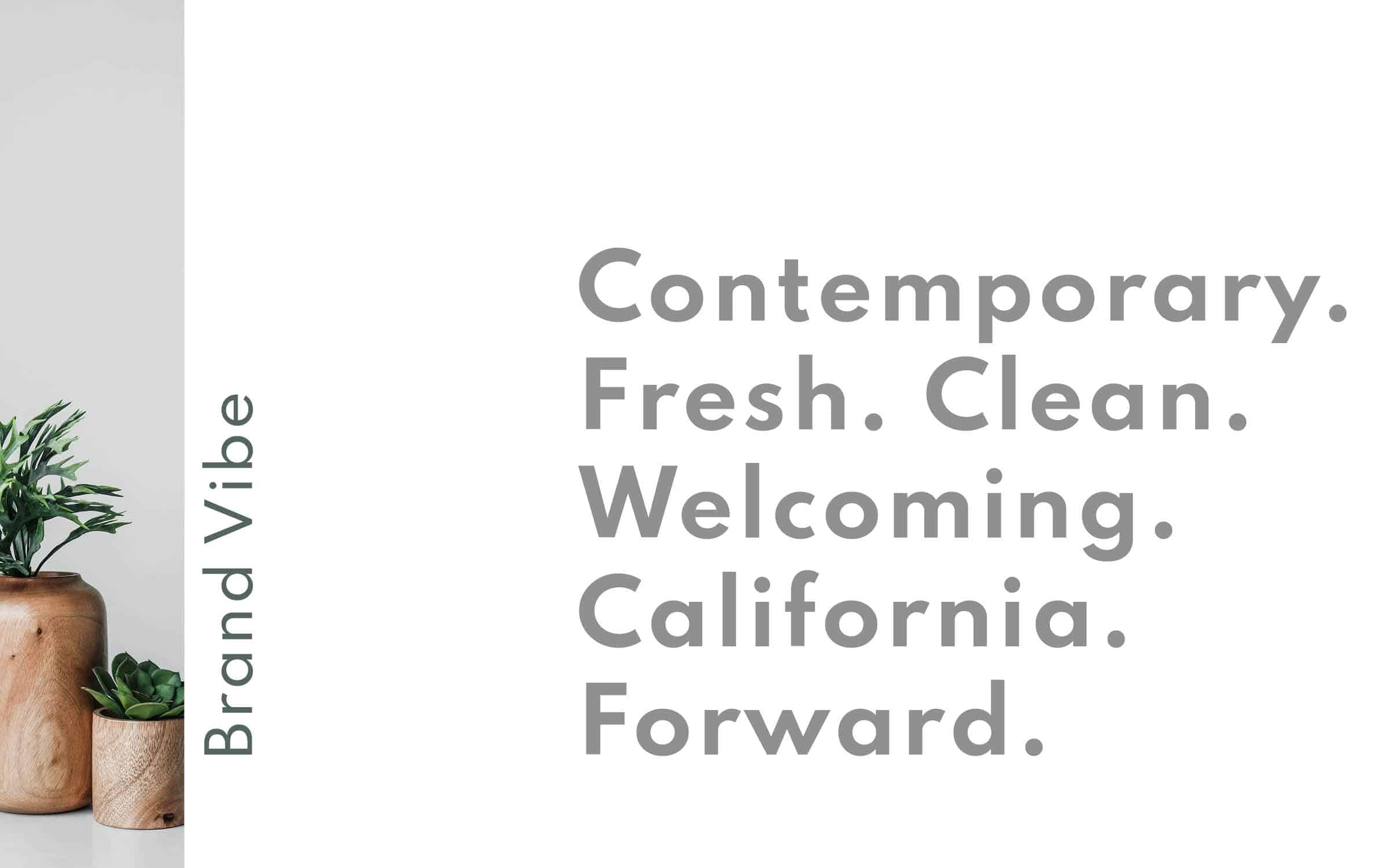
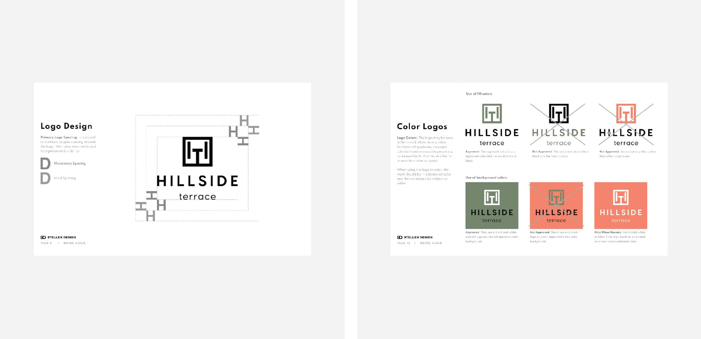
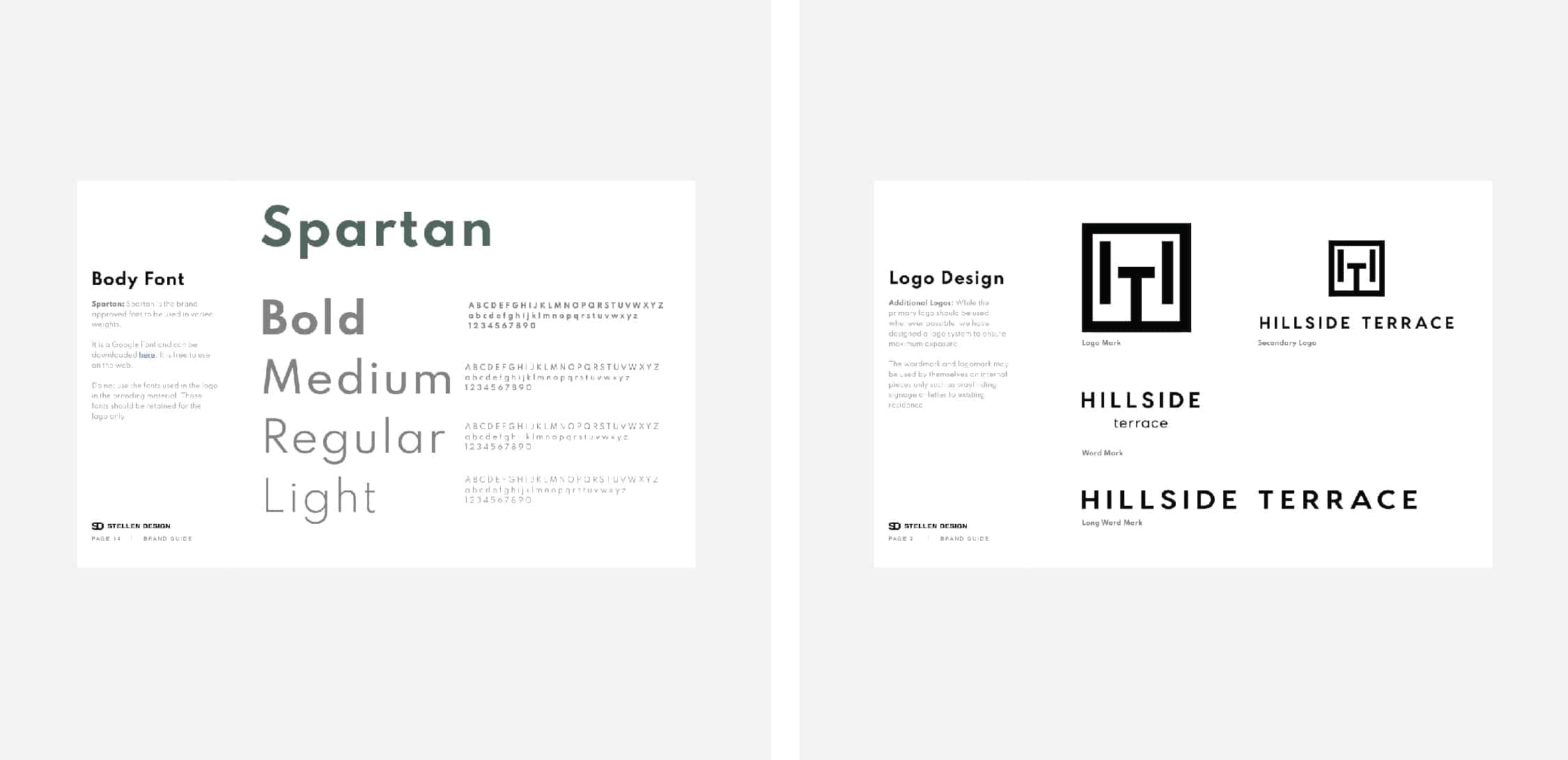
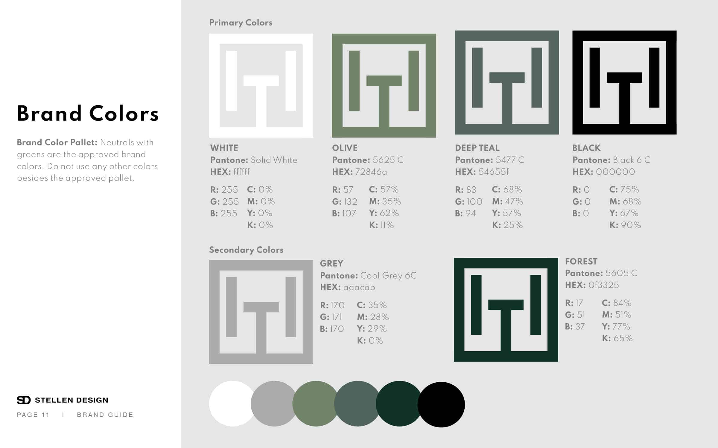
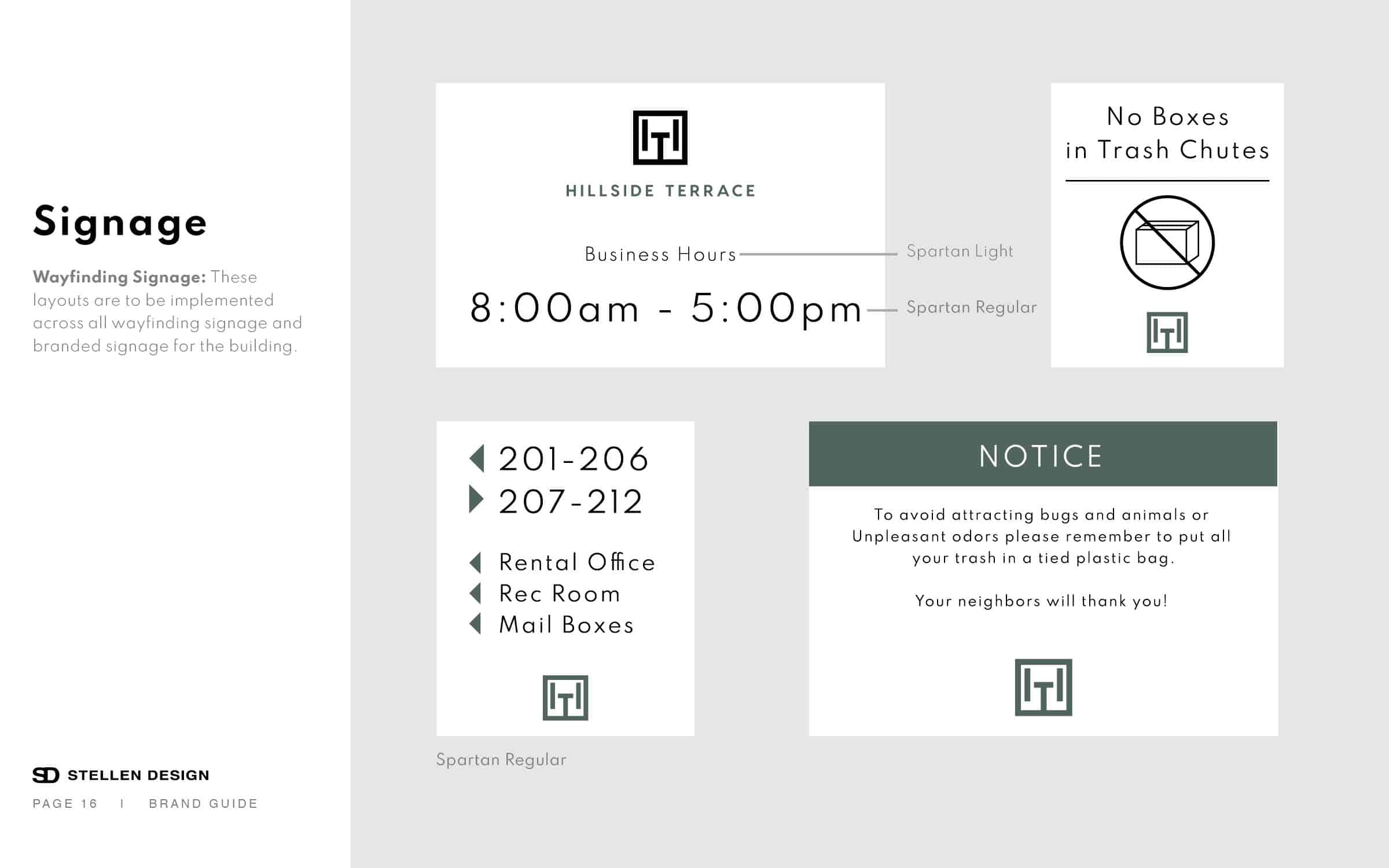
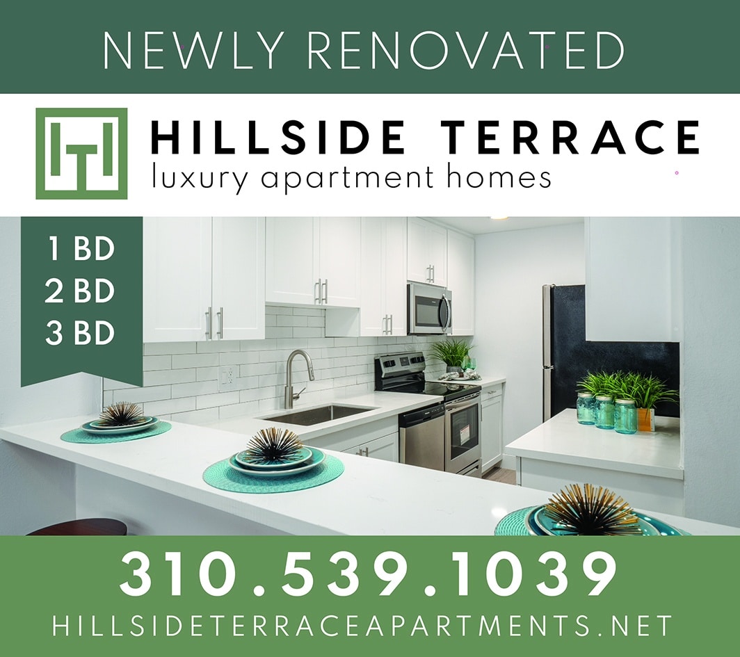
Hillside Terrace is an apartment building in Palos Verdes, CA that we recently had the pleasure of re-branding. The owners invested in new interiors for all their units so we needed to create fresh, inspired branding to match. The area is very green and yes, it’s on a hillside! We created a few logos with hills but landed on a clean monogram of an H and T, which also resembles the shape of the building itself. In addition to the logo design, we also curated a calming green color pallet, defined the brand tone, selected brand fonts, and designed all of the wayfinding signage for the property. We create a logo usage guide for our the client that includes key call outs to keep the integrity of the brand by not misusing the logo. A few things we include are: The various layouts of the logo, yes you get more than one and it’s important to know when to use which logo layout. Spacing around the logo, it’s important to not cram the logo too close to images or copy, it needs breathing room. We also include color! While it’s ideal to use only brand approved colors, that is not always possible. Maybe you are sending your logo out to a third party to be printed on a banner… we show you what logo to use in that scenario so you don’t end up with a green logo being printed on a coral background which could tarnish your beautiful branding!